|
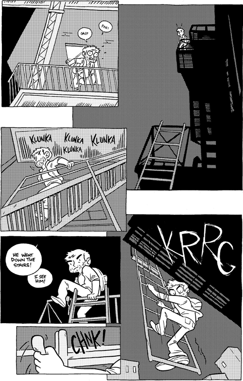
Another page where I kind of regret how grey things turned out. The black came out just how I wanted it, and I’m not sure I did it full justice with such a typical dot pattern. I can’t remember how I did the white lettering in the final panel – I may have drawn it in black and inverted it digitally? But more likely I blackened everything else around it. Either way, much effort – the effects lettering on panel 3 leaves much to be desired. |


First time through I was bothered by the last panel escape (it won't work, the stationary rungs will rip your fingers right off the moving rungs, and how did he get behind?). This time through my take is 'Who cares, it looks COOL'. KRRG.
He swung around mid-fall, that's how! 😛
I wanted to buy this page so bad, sad I slept on it. The silhouetted fire escape and perspective is so perfect and dynamic.
I like the grey, honestly, it communicates the inner-city light-polluted night sky effect incredibly well and drives home the bleakness of Will's situation. Also bravo for the silhouetting in panel… 2? Making this fire-escape-festooned new york apartment block look like a hulking and lifeless piece of quarry machinery