|
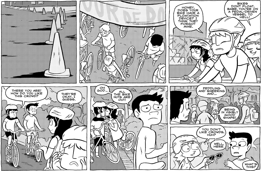
What a no-no, drawing word balloons just outside the top of the panel! Later me would kick my own ass, which I guess is happening right now. There’s just never any reason for this, unless it’s for an explicit purpose (leading the eye, design choice etc). It just looks like I ran out of room, which is true. I do like the flow of the action on this page though, if I’d only gotten my ass in shape to fit it all! |


Compare this interaction between Greg and Hanna with the one in The Witch Lives. It's a thematic 180.
Here it's Greg who's feeling physically deficient, and Hanna offering help from a position of relatively higher emotional maturity.
Later, it's Hanna getting workout tips from Greg after she feels physically deficient, and he ditches her at the party for being emotionally immature.
Idk, the balloon thing seems okay to me as long as it's consistent and also doesn't bite into other panels! Why would it be bad?
Ah, the beginning of Greg growing up.
I never noticed the word bubbles outside the frame! But I actually kind of like them, possibly because I like anything that breaks the frame of comics… I like feeling like the gutter isn't such a no-man's-land.